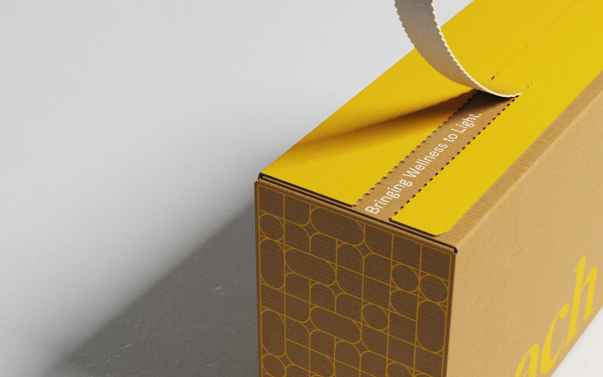
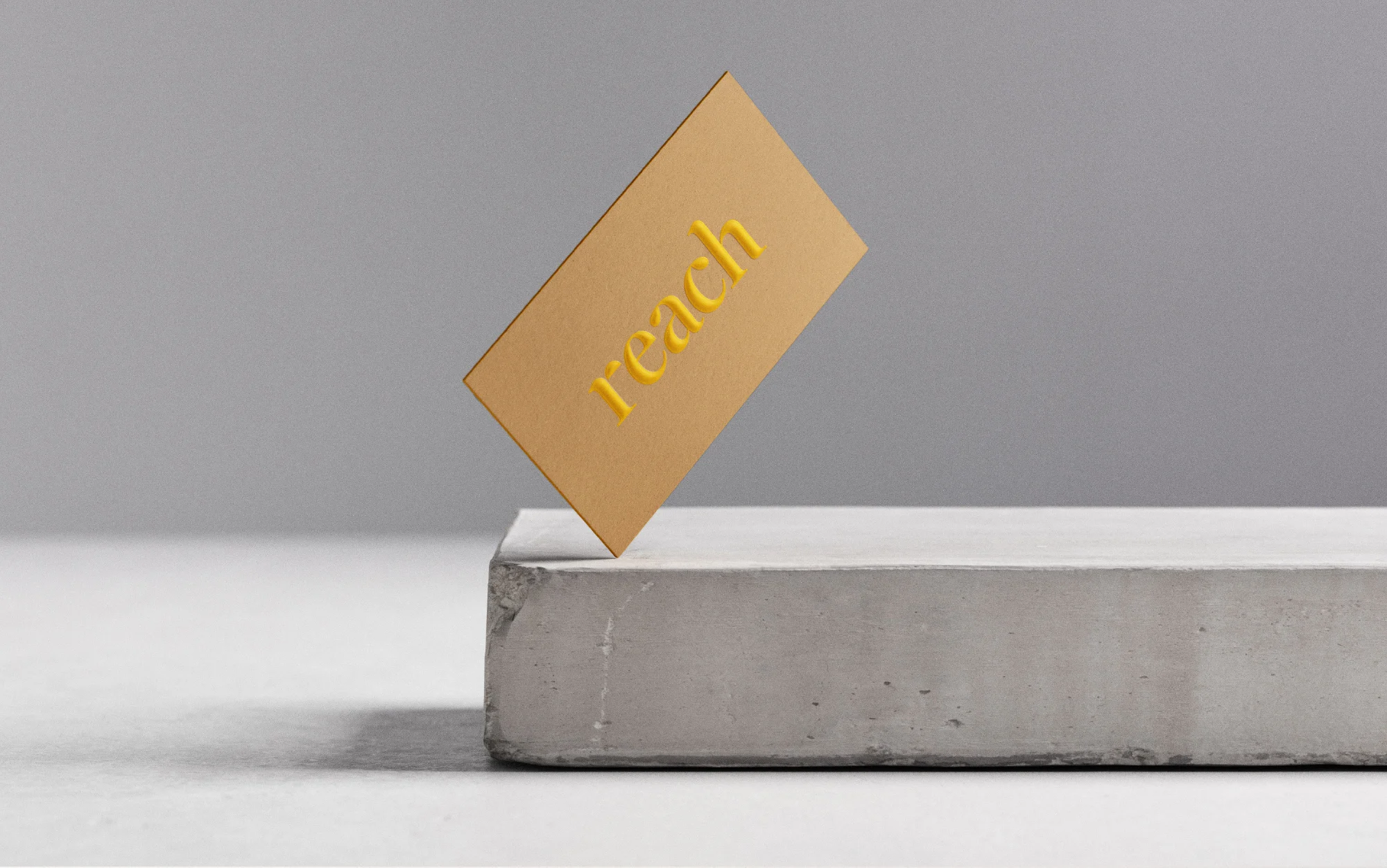
REACH
STRATEGY + BRANDING
BRINGING
WELLNESS
TO LIGHT
Reach is Gantri’s in-house lighting line, thoughtfully designed to support mindful at-home experiences. They came to us to establish an identity for Reach that fully expressed the idea of designing lighting for human wellness.
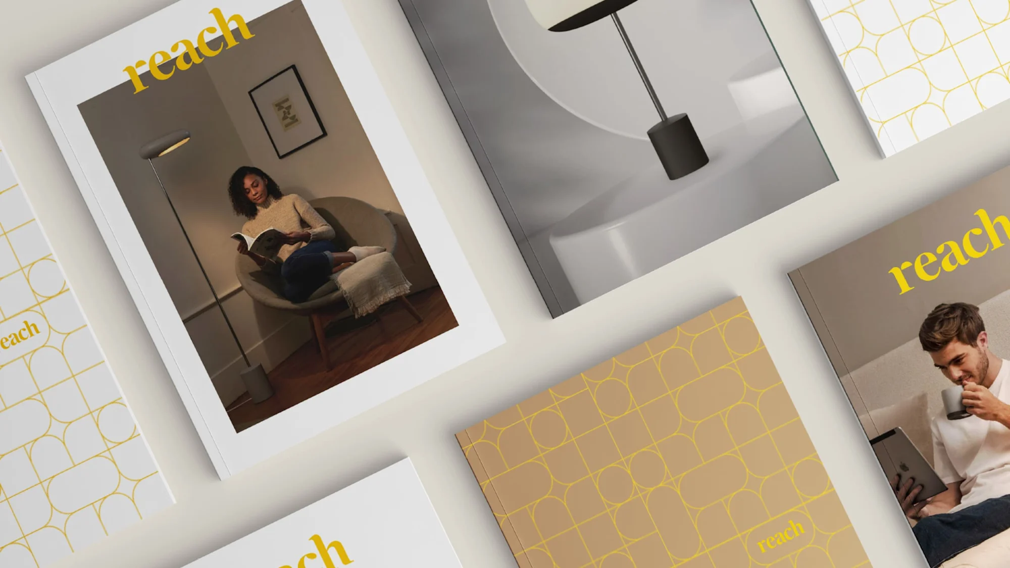
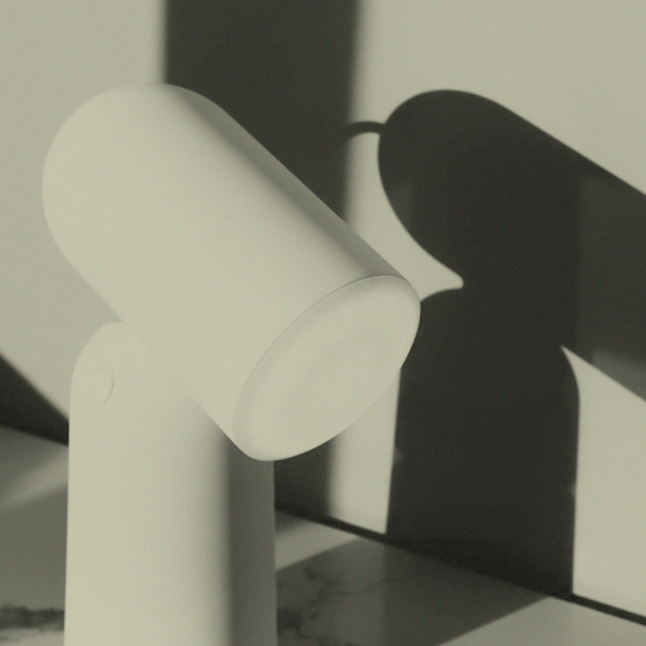
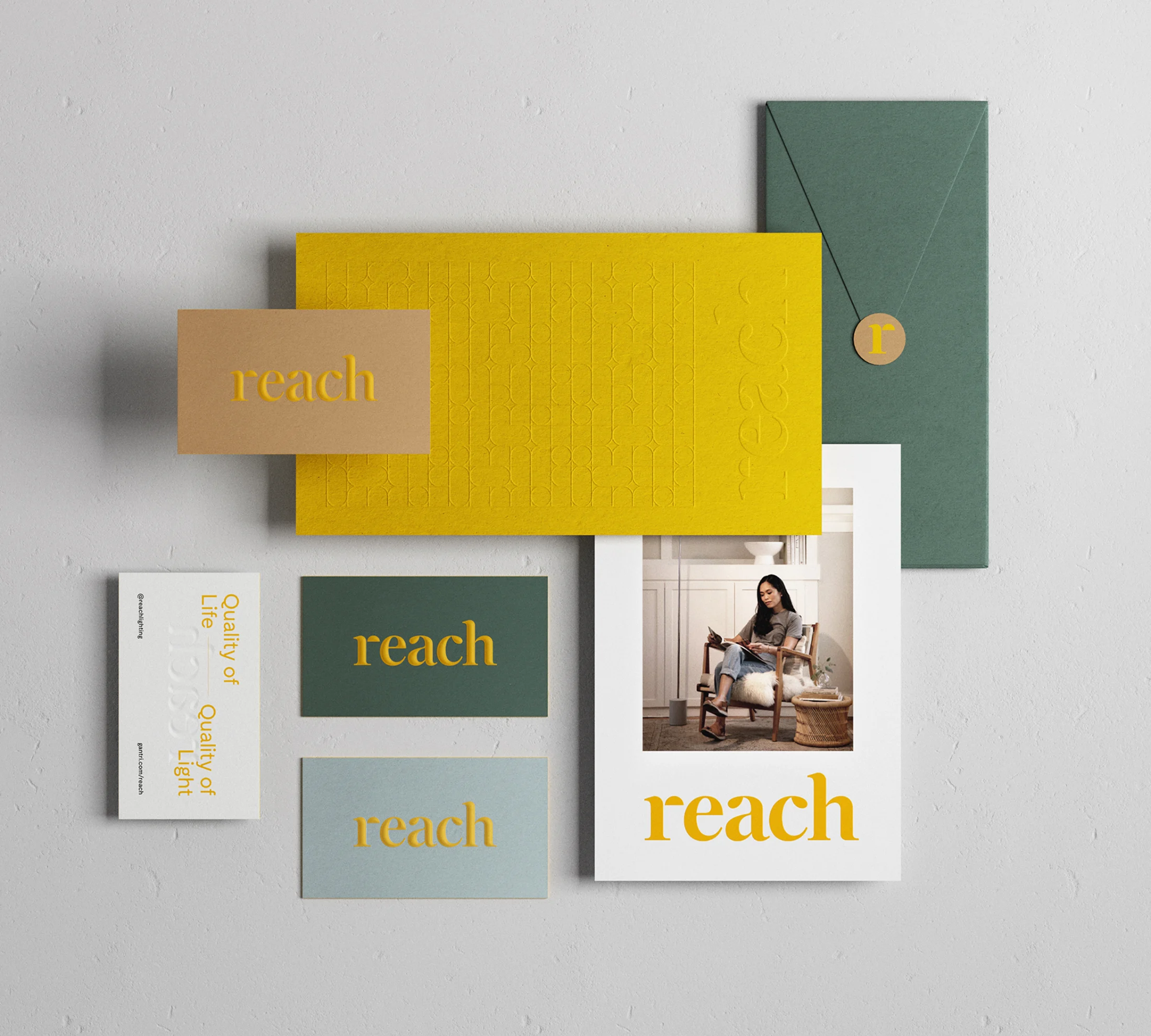
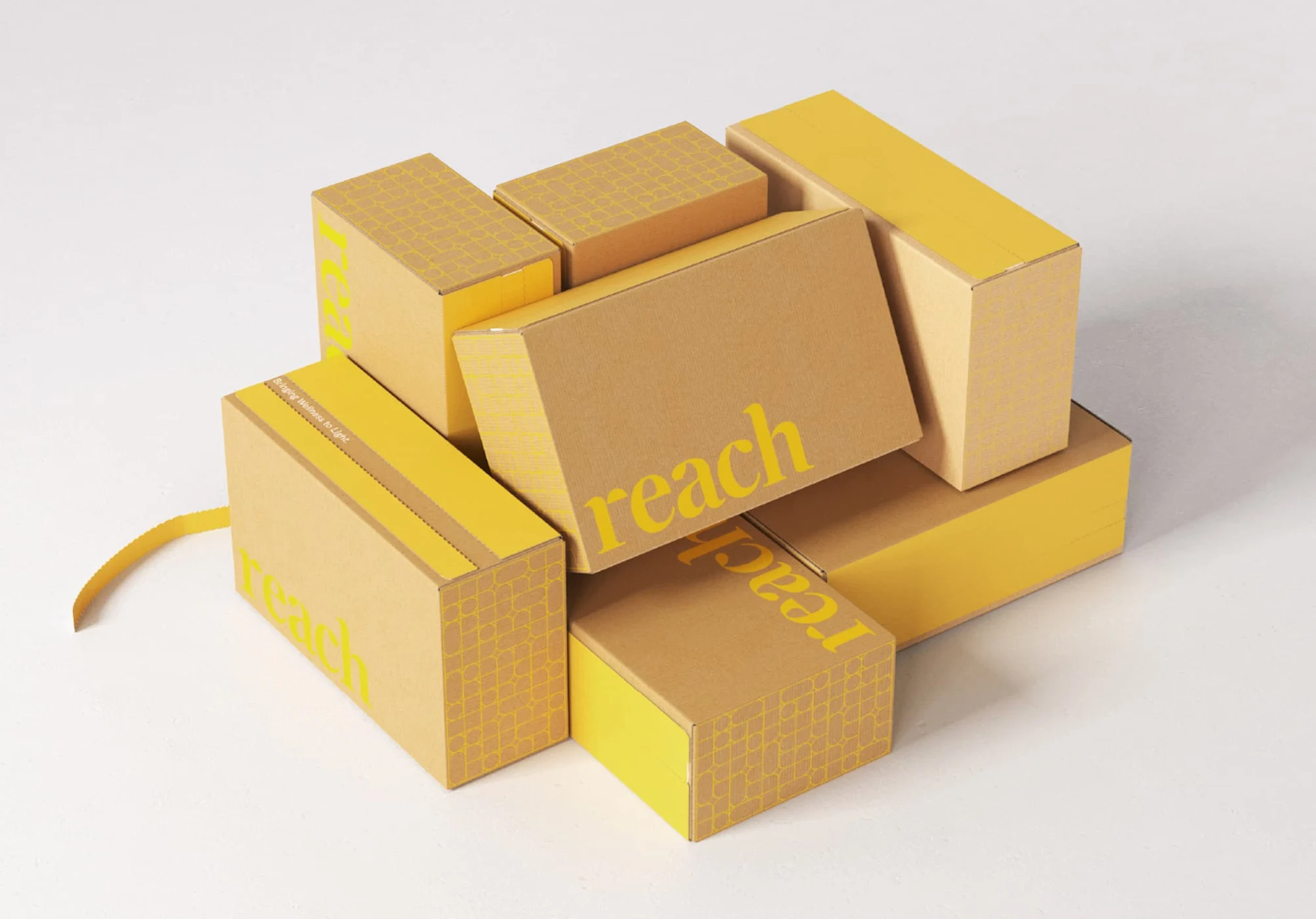
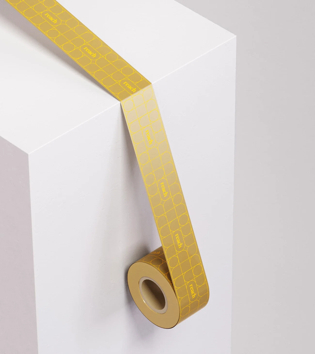
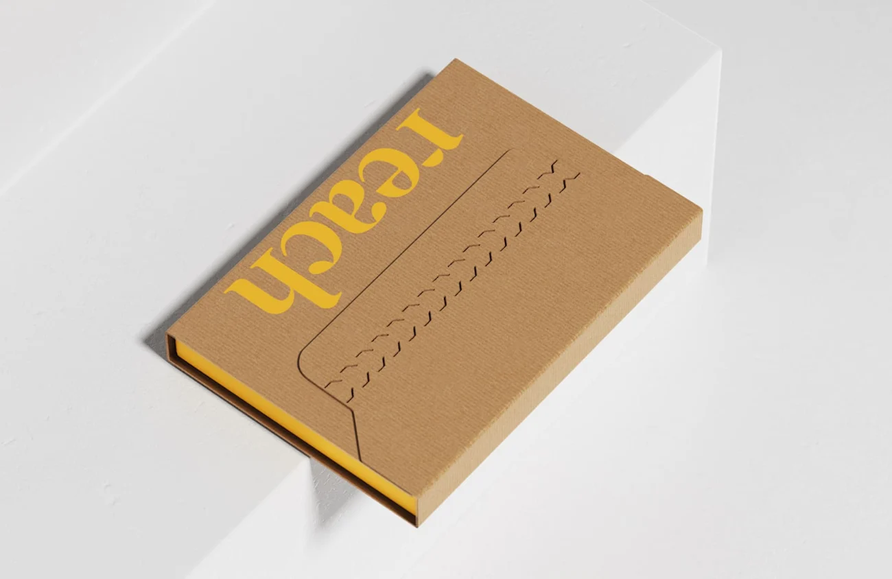
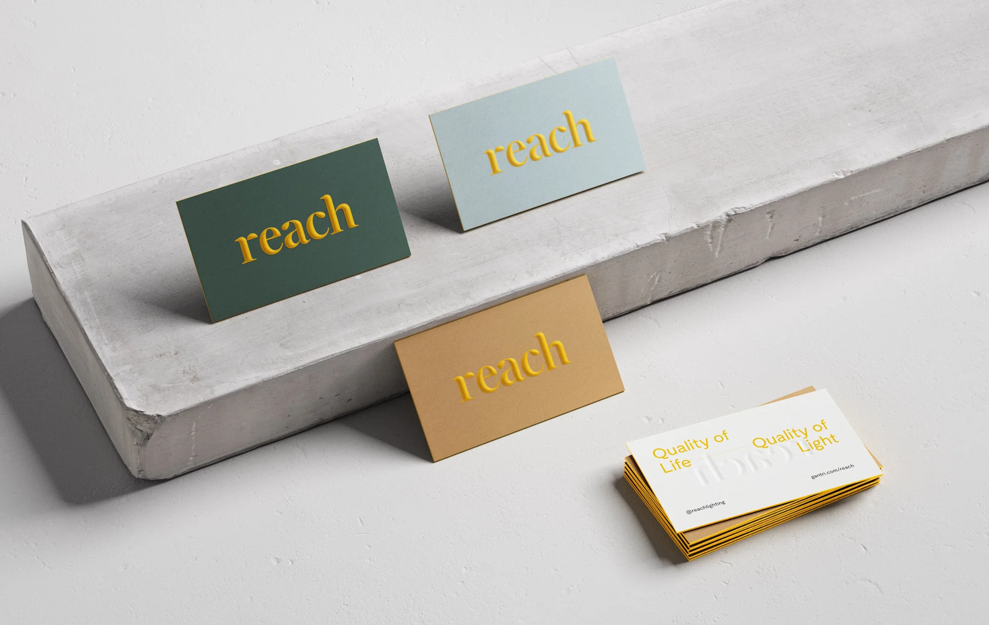
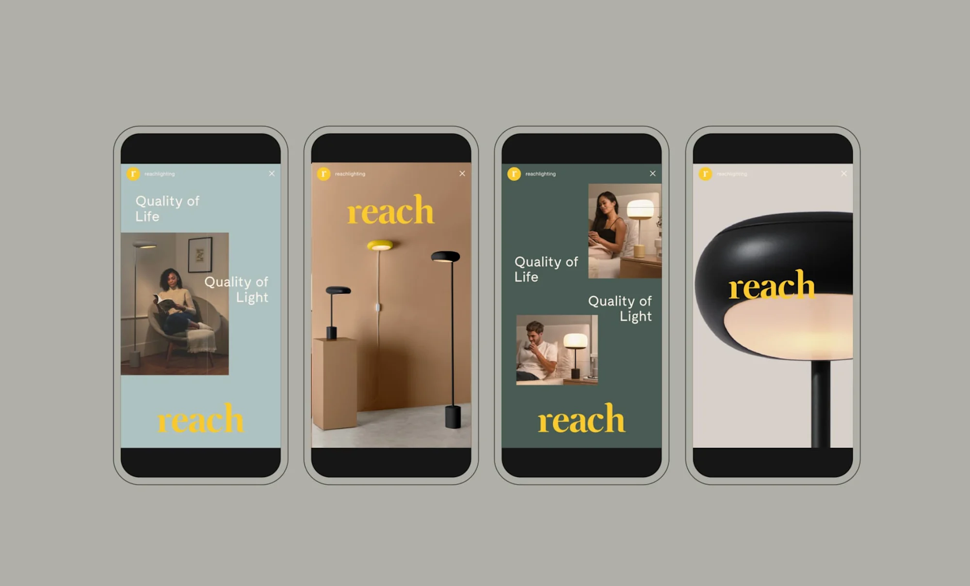
Here’s how: Guided by our strategy, we explored light as a bridge between physical and emotional spaces, influencing the way we see our world. Guided by our strategy, we brought warmth, personality and character to clean design throughout the brand suite. The custom letterforms we created for the logomark feel friendly, taking aesthetic cues from the lighting designs themselves. We evoked the diffusion of light through a space in the submark and graphic patterns. And we activated a modern muted palette with a vibrant pop of yellow, conveying the wellness and warmth of Reach lighting. Thoughtful and warm, rather than overly technical, our messaging speaks to beautiful lighting design improves experiences and shapes healthier humans.

Quality Of Life.
Quality Of Light.
REACH CRAFTS LIGHTING THAT CREATES MINDFUL ENVIRONMENTS TO SUPPORT WELLBEING.

More Projects


Explore how Kriss.ai can revolutionize your dental clinic’s operations. Connect with us at Kriss.ai and join us on this transformative journey.
INFO@KRISS.AI